On August 11 the Victoria HarbourCats closed out their 2013 West Coast League season with a 4-3 win over the Bellingham Bells.
In an earlier post, written mid-way through the season after the 'Cats had played 15 home games, I created a scatter plot matrix to look for correlations between the HarbourCats home attendance and possible influencing factors such as the day of the week and temperature. Now that the season has concluded, it's time to return to the data for all 27 home games, to see if temperature remained the strongest correlate with attendance.
I also took this opportunity to move the source data from Google Documents to GitHub, where it can be accessed directly by the R code – no manual downloads required. The code necessary to make this work is from Christopher Gandrud, who wrote the function source_GitHubData. (Gandrud has also written code to pull data directly from DropBox.)
Read the data
First up, the code installs the packages ggplot2 (for the plots) and devtools (for accessing the data from Github) and opens them into the library. Then the “source_GitHubData” function reads the data.
# load ggplot2
if (!require(ggplot2)) install.packages("ggplot2")
## Loading required package: ggplot2
library(ggplot2)
# Use the function source_GitHubData, which requires the package devtools
if (!require(devtools)) install.packages("devtools")
## Loading required package: devtools
library(devtools)
# The functions' gist ID is 4466237
source_gist("4466237")
## [1] "https://raw.github.com/gist/4466237"
## SHA-1 hash of file is fcb5fe0b4dd7d99d6e747fb8968176c229506ce4
# Download data, which is stored as a csv file at github
HarbourCat.attend <- source_GitHubData("https://raw.github.com/MonkmanMH/HarbourCats/master/HC_attendance_2013.csv")
## Loading required package: httr
Looking at the attendance data
Now the data has been read into our R workspace, the first order of business is a simple plot of the raw attendance data.
# #####
#
# simple line plot of data series
ggplot(HarbourCat.attend, aes(x = num, y = attend)) + geom_point() + geom_line() +
    ggtitle("HarbourCats attendance \n2013 season") + annotate("text", label = "Opening Night",
    x = 3.5, y = 3050, size = 3, fontface = "bold.italic")

From this plot, it's easy to see the spike on the opening game, and the end-of-season surge for the final two games.
When exploring data, it's valuable to get a sense of the distribution. R provides a “summary()” function as well as “sd()” for the standard deviation.
# summarize the distribution of 'attend'
summary(HarbourCat.attend$attend)
##    Min. 1st Qu.  Median    Mean 3rd Qu.    Max.
##     885    1090    1250    1440    1580    3030
sd(HarbourCat.attend$attend)
## [1] 507.8
When looking at these summary stats, a couple of things jump out at me. First of all, the standard deviation is large compared to the total range, suggesting a very dispersed data set. The second thing I notice is that the mean is almost half a standard deviation larger than median, indicating a skew in the data to the large end.
While these numerical representations of the distribution are valuable, a plot of the data can help us understand the data still further. A great graphic tool for looking at a distribution and to identify outliers is the box plot (also known as the box-and-whisker plot).
#
boxplot(HarbourCat.attend$attend, ylab = "attendance", main = "Box plot of HarbourCat attendance")

The box is drawn with the first quartile as the lower edge, and the third quartile as the top edge. The median of the distribution is shown with the thick line that runs across the box. The whiskers show the range of the data, excluding the outliers. And the three dots (in this case, at the top of the chart) are the outliers, defined as being more than 1.5 times the interquartile range (i.e. Q3 - Q1) beyond Q3 or Q1.
Since something special was happening, let's omit those three values as the extreme outliers that were influenced by something other than the weather or the day of the week. Once we've done that, we'll use the “summary()” function again to describe the distribution of the values.
# #####
#
# prune the extreme outliers and structure the data so that attendance is
# last and will appear as the Y axis on plots
HarbourCat.attend.data <- (subset(HarbourCat.attend, num > 1 & num < 26, select = c(num,
    day2, sun, temp.f, attend)))
# print the data table to screen
HarbourCat.attend.data
##    num day2 sun temp.f attend
## 2    2    1   4     64   1082
## 3    3    3   4     66   1542
## 4    4    1   2     63   1014
## 5    5    1   2     60   1003
## 6    6    1   3     66   1015
## 7    7    3   5     64   1248
## 8    8    3   5     70   1640
## 9    9    2   1     64   1246
## 10  10    3   5     70   1591
## 11  11    3   5     73   1620
## 12  12    2   5     70   1402
## 13  13    1   5     72   1426
## 14  14    1   5     73   1187
## 15  15    1   5     72   1574
## 16  16    3   5     73   1515
## 17  17    3   5     70   1052
## 18  18    2   5     72   1208
## 19  19    3   5     69   1292
## 20  20    2   5     71   1218
## 21  21    1   5     64   1013
## 22  22    1   5     62   1104
## 23  23    1   2     63    885
## 24  24    1   3     63   1179
## 25  25    3   4     73   1731
# summarize the distribution of the pruned version of 'attend'
summary(HarbourCat.attend.data$attend)
##    Min. 1st Qu.  Median    Mean 3rd Qu.    Max.
##     885    1070    1230    1280    1520    1730
sd(HarbourCat.attend.data$attend)
## [1] 245.7
From these summary statistics, we see that the nature of the data set has changed significantly. The median and mean are almost identical, and the standard deviation is half the magnitude without the outliers.
The scatterplot matrix
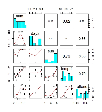
With the outliers removed, we can move on to the scatter plot matrix. This time we'll just run the all-in version that includes a smoothing line on the scatter plot, as well as a histogram of the variable and the correlation coefficients.
# ################### scatter plot matrix ###################
#
# scatter plot matrix - with correlation coefficients define panels
# (copy-paste from the 'pairs' help page)
panel.cor <- function(x, y, digits = 2, prefix = "", cex.cor, ...) {
    usr <- par("usr")
    on.exit(par(usr))
    par(usr = c(0, 1, 0, 1))
    r <- abs(cor(x, y))
    txt <- format(c(r, 0.123456789), digits = digits)[1]
    txt <- paste0(prefix, txt)
    if (missing(cex.cor))
        cex.cor <- 0.8/strwidth(txt)
    text(0.5, 0.5, txt, cex = cex.cor * r)
}
#
panel.hist <- function(x, ...) {
    usr <- par("usr")
    on.exit(par(usr))
    par(usr = c(usr[1:2], 0, 1.5))
    h <- hist(x, plot = FALSE)
    breaks <- h$breaks
    nB <- length(breaks)
    y <- h$counts
    y <- y/max(y)
    rect(breaks[-nB], 0, breaks[-1], y, col = "cyan", ...)
}
# run pairs plot
pairs(HarbourCat.attend.data[, 1:5], upper.panel = panel.cor, diag.panel = panel.hist,
    lower.panel = panel.smooth)

Conclusion
A few more data points hasn't fundamentally changed the analysis. Temperature remains the best predictor of attendance, with a correlation coefficient of 0.68. The day of the week was also a fairly strong predictor, with bigger crowds on Friday and Saturday nights than the Sunday day games and the weekday evening games. (No surprise there, really.)
I was surprised to see that attendance seemed to flag as the season went on – you can see the drop shown in the smoothing line in the plot in the lower left corner (num by attend, where num is the number of the game from 2-25). But this drop can be explained by both the day of the week and the temperature. From Monday July 29 to Thursday August 1, the temperature was 17 or 18 Celsius (62 to 63 Farenheit). On the Wednesday of this stretch (July 31), under mainly cloudy skies and the temperature at 17 Celsius (63 Farenheit), only 885 people turned up to watch the game – the only time all season the HarbourCats drew fewer than 1,000 fans to a game.
The code and data for this analysis can be found at GitHub: https://github.com/MonkmanMH/HarbourCats -30-




 Posts
Posts

