December 17, 2013

Book Review: Analyzing Baseball Data with R

by Max Marchi and Jim Albert (2014, CRC Press)


The Sabermetric bookshelf, #3


Here we have the perfect book for anyone who stumbles across this blog--the intersection of R and baseball data. The open source statistical programming environment of R is a great tool for anyone analyzing baseball data, from the robust analytic functions to the great visualization packages. The particular readership niche might be small, but as both R and interest in sabermetrics expand, it's a natural fit.


And one would be hard pressed to find better qualified authors, writers who have feet firmly planted in both worlds.  Max Marchi is a writer for Baseball Prospectus, and it's clear from the ggplot2 charts in his blog entries (such as this entry on left-handed catchers) that he's an avid R user.

Jim Albert is a Professor in the Department of Mathematics and Statistics at Bowling Green State University; three of his previous books sit on my bookshelf. Curve Ball, written with Jay Bennett, is pure sabermetrics, and one of the best books ever written on the topic (and winner of SABR's Baseball Research Award in 2002).  Albert's two R-focussed  books, the introductory R by Example (co-authored with Maria Rizzo) and the more advanced Bayesian Computation with R, are intended as supplementary texts for students learning statistical methods. Both employ plenty of baseball examples in their explanations of statistical analysis using R.

In Analyzing Baseball Data with R Marchi and Albert consolidate this joint expertise, and have produced a book that is simultaneously interesting and useful.

The authors takes a very logical approach to the subject at hand. The first chapter concerns the three sources of baseball data that are referenced throughout the book:
- the annual summaries contained with the Lahman database,
- the play-by-play data at Retrosheet, and
- the pitch-by-pitch PITCHf/x data.
The chapter doesn't delve into R, but summarizes the contents of the three data sets, and takes a quick look at the types of questions that can be answered with each.

The reader first encounters R in the second and third chapters, titled "Introduction to R" and "Traditional Graphics". These two chapters cover many of the basic topics that a new R user needs to know, starting with installing R and RStudio, then moving on to data structures like vectors and data frames, objects, functions, and data plots. Some of the key R packages are also covered in these chapters, both functional packages like plyr and data packages, notably Lahman, the data package containing the Lahman database.

The material covered in these early chapters are things I learned early on in my own R experience, but whereas I had relied on multiple sources and an unstructured ad hoc approach, in Analyzing Baseball Data with R a newcomer to R will find the basics laid out in a straight-forward and logical progression. These chapters will most certainly help them climb the steep learning curve faced by every neophyte R user.  (It is worth noting that the "Introduction to R" chapter relies heavily on a fourth source of baseball data -- the 1965 Warren Spahn Topps card, the last season of his storied career. Not all valuable data are big data.)

From that point on, the book tackles some of the core concepts of sabermetrics. This includes the relationship between runs and wins, run expectancy, career trajectories, and streaky performances.  As the authors work through these and other topics, they weave in information about additional R functions and packages, along with statistical and analytic concepts.  As one example, one chapter introduces Markov Chains in the context of using R to simulate half inning, season, and post-season outcomes.

The chapter "Exploring Streaky Performances" provides the opportunity to take a closer look at how Analyzing Baseball Data with R compares to Albert's earlier work.  In this case, the chapter uses moving average and simulation methodologies, providing the data code to examine recent examples (Ichiro and Raul Ibanez).  This is methodologically similar to what is described in Curve Ball, but with the addition of "here's the data and the code so you can replicate the analysis yourself".  This approach differs substantially from the much more mathematical content in Albert's text Bayesian Computation with R, where the example of streaky hitters is used to explore beta functions and the laplace R function.

Woven among these later chapters are also ones that put R first, and use baseball data as the examples. A chapter devoted to the advanced graphics capabilities of the R splits time between the packages lattice and ggplot2. The examples used in this chapter include  visualizations that are used to analyze variations in Justin Verlander's pitch speed.

Each chapter of the book also includes "Further Reading" and "Exercises", which provide readers with the chance to dig deeper into the topic just covered and to apply their new-found skills. The exercises are consistently interesting and often draw on previous sabermetric research.  Here's a couple of examples:
  • "By drawing a contour plot, compare the umpire's strike zone for left-handed and right-handed batters. Use only the rows of the data frame where the pitch type is a four-seam fastball." (Chapter 7)
  • "Using [Bill] James' similarity score measure ..., find the five hitters with hitting statistics most similar to Willie Mays." (Chapter 8)
The closing pages of the book are devoted to technical arcana regarding the data sources, and how-to instructions on obtaining those data.

The authors have established a companion blog (http://baseballwithr.wordpress.com/), which has an expansion of the analytics presented in the book.  For example, the entry from December 12, 2013 goes deeper into ggplot2 capabilities to enhance and refine charts that were described in the book.

Analyzing Baseball Data with R provides readers with an excellent introduction to both R and sabermetrics, using examples that provide nuggets of insight into baseball player and team performance. The examples are clear, the R code is well explained and easy to follow, and I found the examples consistently interesting. All told, Analyzing Baseball Data with R will be an extremely valuable addition to the practicing sabermetrician's library, and is most highly recommended.

Additional Resources


Jim Albert and Jay Bennett (2003), Curve Ball: Baseball, Statistics, and the Role of Chance in the Game (revised edition), Copernicus Books.

Jim Albert and Maria Rizzo (2011), R by Example, Springer.

Jim Albert (2009), Bayesian Computation with R (2nd edition), Springer.

An interview with Max Marchi, originally posted at MilanoRnet and also available through R-bloggers

-30-


December 1, 2013

A few random things

The creation of random numbers, or the random selection of elements in a set (or population), is an important part of statistics and data science. From simulating coin tosses to selecting potential respondents for a survey, we have a heavy reliance on random number generation.
R offers us a variety of solutions for random number generation; here's a quick overview of some of the options.

runif, rbinom, rnorm

One simple solution is to use the runif function, which generates a stated number of values between two end points (but not the end points themselves!) The function uses the continuous uniform distribution, meaning that every value between the two end points has an equal probability of being sampled.
Here's the code to produce 100 values between 1 and 100, and then print them.
RandomNumbers <- runif(100, 1, 100)
RandomNumbers
##   [1] 22.290 33.655 89.835 38.535 24.601 11.431  7.047 94.958 83.703 76.847
##  [11] 58.429 20.667 25.796 91.821  8.741 65.696 24.262  8.077 51.399 19.652
##  [21] 64.883 33.258 55.488  6.828 14.925 11.480 72.783  2.549 78.706 49.563
##  [31] 10.829 27.653 70.304 96.759 12.614 66.610 82.467  8.506 71.719 86.586
##  [41] 69.519 11.538 72.321 63.126 42.754 60.139 44.854 71.088 15.165 67.818
##  [51] 83.342  9.894 64.497 96.620 64.286 20.162 16.343 53.800 31.380 24.418
##  [61] 13.740 47.458 80.037 13.189 45.496 20.697 28.240 60.003 84.350 14.888
##  [71] 20.084  3.003  1.191 28.748  4.528 40.568 90.963 82.640 15.885 95.029
##  [81] 54.166 17.315 43.355  9.762 74.012 64.537 74.131 24.758 41.922 65.458
##  [91] 11.423 41.084 22.514 77.329 76.879 43.954 78.471 24.727 69.357 60.118
R helpfully has random generators from a plethora of distributions (see http://cran.r-project.org/web/views/Distributions.html under the heading “Random Number Generators”). For example, the equivalent function to pull random numbers from the binomial distribution is rbinom. In the following example, the code generates 100 iterations of a single trial where there's a 0.5 (50/50) probabilty – as you would get with one hundred coin tosses. So let's call the object OneHundredCoinTosses. The table function then gives us a count of the zeros and ones in the object.
OneHundredCoinTosses <- rbinom(100, 1, 0.5)
OneHundredCoinTosses
##   [1] 1 0 0 1 1 1 0 1 1 1 1 0 0 1 0 1 1 0 1 1 0 1 1 0 1 0 0 1 0 0 1 1 1 0 0
##  [36] 1 0 0 0 0 0 1 0 1 1 0 0 0 1 0 1 0 1 0 1 1 1 0 1 0 0 0 1 1 1 0 1 0 0 1
##  [71] 1 0 0 0 1 0 1 1 1 1 0 0 0 0 1 1 1 0 0 1 1 1 0 0 1 1 0 1 0 1
table(OneHundredCoinTosses)
## OneHundredCoinTosses
##  0  1 
## 48 52
In this variant, we'll toss our coin again, but this time it will be 100 iterations of 10 trials. R will generate the number of successes per trial. A plot of the histogram would show how with enough iterations, we'd get something that looks very much like a normal distribution curve.
OneHundredCoinTrials <- rbinom(100, 10, 0.5)
OneHundredCoinTrials
##   [1]  5  4  7  7  4  2  3  3  6  6  6  5  4  6  5  6  4  7  3  3  6  5  5
##  [24]  7  4  5  6  3  7  4 10  5  3  6  6  5  7  6  3  6  4  7  7  4  3  6
##  [47]  6  2  2  7  5  6  5  8  4  3  5  5  2  7  5  4  4  1  4  5  7  5  6
##  [70]  9  6  3  7  4  4  2  3  6  3  5  6  6  5  8  5  5  7  5  7  4  2  3
##  [93]  5  5  7  5  4  6  0  6
table(OneHundredCoinTrials)
## OneHundredCoinTrials
##  0  1  2  3  4  5  6  7  8  9 10 
##  1  1  6 13 16 23 21 15  2  1  1
And there's rnorm for the normal distribution. In this case, the second number in the function is the mean and the third is the standard deviation. With this example, the code generates 100 values from a normal distribution with a mean of 50 and a standard deviation of 12.5.
RandomNormal <- rnorm(100, 50, 12.5)
RandomNormal
##   [1] 52.67 36.55 57.48 63.00 53.65 52.05 65.39 36.16 53.03 53.22 53.61
##  [12] 65.66 47.08 41.87 80.60 67.34 49.56 54.09 50.51 48.35 33.72 47.31
##  [23] 51.22 51.01 56.76 51.01 79.84 37.27 33.67 41.73 49.34 62.04 61.48
##  [34] 37.49 56.54 63.87 49.13 36.11 47.14 34.67 57.88 34.45 50.46 48.68
##  [45] 66.36 45.32 51.72 36.64 41.35 48.09 35.50 55.30 42.13 26.29 30.68
##  [56] 53.08 60.53 40.96 35.04 60.64 74.57 49.00 62.41 37.19 52.64 39.80
##  [67] 31.66 49.13 36.05 49.98 55.00 72.42 56.64 53.44 50.50 54.02 60.74
##  [78] 39.32 53.72 75.50 46.87 12.10 45.09 70.40 53.11 37.36 58.97 67.09
##  [89] 45.63 55.44 46.66 31.69 36.68 59.28 55.09 53.25 49.52 59.87 59.16
## [100] 80.30

sample

Another approach to randomization is the sample function, which pulls elements from an object (such as a vector) of defined values or, alternatively, can be specified to select cases from a string of integers. The function also has the option of specifying whether replacement will be used or not. (See http://cran.r-project.org/web/packages/sampling/index.html)
In the first example of sample, we'll generate 100 values (the second value specified in the function) from the integers between 1 and 99 (the first value specified), with replacement – so there's a possibility of duplicates. The code adds the sort function so that we can easily spot the duplicates.
RandomSample <- sort(sample(99, 100, replace = TRUE))
RandomSample
##   [1]  1  1  2  2  2  5  5  5  7  8 11 11 12 12 12 13 15 15 16 16 19 19 21
##  [24] 23 23 23 23 23 25 26 27 30 30 31 32 33 34 35 35 35 35 37 38 40 41 42
##  [47] 42 42 42 45 46 46 47 48 48 50 52 52 54 54 54 54 54 57 58 61 62 63 63
##  [70] 64 66 66 67 67 69 70 71 71 71 73 73 74 78 78 80 80 82 83 84 84 85 86
##  [93] 86 91 93 94 96 96 98 98
In a second example, we'll generate 5 values (the second value specified) from a list of 13 names that we predefine, without replacement. Note that the default setting in sample is “without replacement”, so there should be no duplicates.
# the list of party-goers
dwarves <- c("Fí­li", "Kíli", "Balin", "Dwalin", "Óin", "Glóin", "Bifur", "Bofur", 
    "Bombur", "Ori", "Nori", "Dori", "Thorin")  # draw a sorted sample of 50 with replacement
Party <- sort(sample(dwarves, 5))
# print the names
Party
## [1] "Dwalin" "Fí­li"   "Nori"   "Ori"    "Thorin"
There is also the sample.int variant which insists on integers for the values. Here's the code to randomly select 6 numbers between 1 and 49, without replacement.
six49numbers <- sort(sample.int(49, 6, replace = FALSE))
six49numbers
## [1]  3 15 16 24 35 44

Controlling random number generation: set.seed and RNGkind

It sounds like an oxymoron--how can you control something that is random? The answer is that in many computer programs and programming languages, R included, many of the functions that are dubbed random number generation really aren't. I won't get into the arcana, but runif (and its ilk) and sample all rely on pseudo-random approaches, methods that are close enough to being truly random for most purposes. (If you want to investigate this further in the context of R, I suggest starting with John Ramey's post at http://www.r-bloggers.com/pseudo-random-vs-random-numbers-in-r-2/ )
With the set.seed command, an integer is used to start a random number generation, allowing the same sequence of “random” numbers to be selected repeatedly. In this example, we'll use the code written earlier to sample 6 numbers between 1 and 49, and repeat it three times.
The first time through, set.seed will define the starting seed as 1, then for the second time through, the seed will be set to 13, leading to a different set of 6 numbers. The third iteration will reset the starting seed to 1, and the third sample set of 6 numbers will be the same as the first sample.
set.seed(1)
six49numbers <- sort(sample.int(49, 6))
six49numbers
## [1] 10 14 18 27 40 42
set.seed(13)
six49numbers <- sort(sample.int(49, 6))
six49numbers
## [1]  1  5 12 19 35 44
set.seed(1)
six49numbers <- sort(sample.int(49, 6))
six49numbers
## [1] 10 14 18 27 40 42
The first and third draws contain the same 6 integers.
Another control of the random number generation is RNGkind. This command defines the random number generation method, from an extensive list of methodologies. The default is Mersene Twister (http://en.wikipedia.org/wiki/Mersenne_twister), and a variety of others are available.
The R documentation page on Random{}, with both set.seed and RNGkind, can be found here: http://stat.ethz.ch/R-manual/R-devel/library/base/html/Random.html

random

While the methods above are pseudo-random, there are methods available that generate truly random numbers. One is the service provided by random.org (http://www.random.org/).
The R package random (documentation here: http://cran.r-project.org/web/packages/random/) uses the random.org service to generate random numbers and return them into an R object. While the functions in the package can return random integers, randomized sequences, and random strings, and has the flexibility to define the shape of the matrix (i.e. the number of columns).
It's worth nothing that free users or random.org are confronted by daily limits to the volume of calls you can make to random.org (paying customers don't have these limits).
Here's an example to generate 20 random numbers from random.org, defined as being between 100 and 999 (that is to say, three digit numbers) and present them in two columns.
# load random
if (!require(random)) install.packages("random")
## Loading required package: random
library(random)
# 
twentytruerandom <- randomNumbers(n = 20, min = 100, max = 999, col = 2, check = TRUE)
# note: the 'check=' sets whether quota at server should be checked first
twentytruerandom
##        V1  V2
##  [1,] 531 402
##  [2,] 559 367
##  [3,] 616 789
##  [4,] 830 853
##  [5,] 382 436
##  [6,] 336 737
##  [7,] 769 548
##  [8,] 293 818
##  [9,] 746 609
## [10,] 108 331

References

Paul Teetor's R Cookbook (O'Reilly, 2011) has a chapter on probability (Chapter 8) that includes good examples of various random number generation in R.
Jim Albert & Maria Rizzo, R by Example (Springer, 2012), Chapter 11 “Simulation Experiments” and Chapter 13 “Monte Carlo Methods”, contain a variety of applications of random number generation using sample and rbinom to approximate and understand probability experiments.
For an in-depth look at random sampling in the context of survey design, see Thomas Lumley Complex Surveys: A Guide to Analysis Using R (Wiley, 2010).
If you're interested in testing a random number generator, check out http://www.johndcook.com/blog/2010/12/06/how-to-test-a-random-number-generator-2/
Joseph Rickert's blog entry at blog.revolutionanalytics.com gives a good rundown of the applications and approach for parallel random number generation http://blog.revolutionanalytics.com/2013/06/intro-to-parallel-random-number-generation-with-revoscaler.html
-30-

September 1, 2013

Fair weather fans, redux

Fair weather fans, redux Or, A little larger small sample

On August 11 the Victoria HarbourCats closed out their 2013 West Coast League season with a 4-3 win over the Bellingham Bells.

In an earlier post, written mid-way through the season after the 'Cats had played 15 home games, I created a scatter plot matrix to look for correlations between the HarbourCats home attendance and possible influencing factors such as the day of the week and temperature. Now that the season has concluded, it's time to return to the data for all 27 home games, to see if temperature remained the strongest correlate with attendance.

I also took this opportunity to move the source data from Google Documents to GitHub, where it can be accessed directly by the R code – no manual downloads required. The code necessary to make this work is from Christopher Gandrud, who wrote the function source_GitHubData. (Gandrud has also written code to pull data directly from DropBox.)

Read the data

First up, the code installs the packages ggplot2 (for the plots) and devtools (for accessing the data from Github) and opens them into the library. Then the “source_GitHubData” function reads the data.

# load ggplot2
if (!require(ggplot2)) install.packages("ggplot2")
## Loading required package: ggplot2
library(ggplot2)
# Use the function source_GitHubData, which requires the package devtools
if (!require(devtools)) install.packages("devtools")
## Loading required package: devtools
library(devtools)
# The functions' gist ID is 4466237
source_gist("4466237")
## [1] "https://raw.github.com/gist/4466237"
## SHA-1 hash of file is fcb5fe0b4dd7d99d6e747fb8968176c229506ce4
# Download data, which is stored as a csv file at github
HarbourCat.attend <- source_GitHubData("https://raw.github.com/MonkmanMH/HarbourCats/master/HC_attendance_2013.csv")
## Loading required package: httr

Looking at the attendance data

Now the data has been read into our R workspace, the first order of business is a simple plot of the raw attendance data.

# #####
# 
# simple line plot of data series
ggplot(HarbourCat.attend, aes(x = num, y = attend)) + geom_point() + geom_line() + 
    ggtitle("HarbourCats attendance \n2013 season") + annotate("text", label = "Opening Night", 
    x = 3.5, y = 3050, size = 3, fontface = "bold.italic")

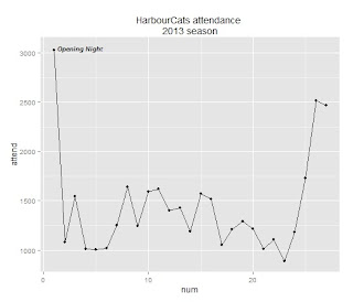
From this plot, it's easy to see the spike on the opening game, and the end-of-season surge for the final two games.

When exploring data, it's valuable to get a sense of the distribution. R provides a “summary()” function as well as “sd()” for the standard deviation.

# summarize the distribution of 'attend'
summary(HarbourCat.attend$attend)
##    Min. 1st Qu.  Median    Mean 3rd Qu.    Max. 
##     885    1090    1250    1440    1580    3030
sd(HarbourCat.attend$attend)
## [1] 507.8

When looking at these summary stats, a couple of things jump out at me. First of all, the standard deviation is large compared to the total range, suggesting a very dispersed data set. The second thing I notice is that the mean is almost half a standard deviation larger than median, indicating a skew in the data to the large end.

While these numerical representations of the distribution are valuable, a plot of the data can help us understand the data still further. A great graphic tool for looking at a distribution and to identify outliers is the box plot (also known as the box-and-whisker plot).

#
boxplot(HarbourCat.attend$attend, ylab = "attendance", main = "Box plot of HarbourCat attendance")

The box is drawn with the first quartile as the lower edge, and the third quartile as the top edge. The median of the distribution is shown with the thick line that runs across the box. The whiskers show the range of the data, excluding the outliers. And the three dots (in this case, at the top of the chart) are the outliers, defined as being more than 1.5 times the interquartile range (i.e. Q3 - Q1) beyond Q3 or Q1.

Since something special was happening, let's omit those three values as the extreme outliers that were influenced by something other than the weather or the day of the week. Once we've done that, we'll use the “summary()” function again to describe the distribution of the values.

# #####
# 
# prune the extreme outliers and structure the data so that attendance is
# last and will appear as the Y axis on plots
HarbourCat.attend.data <- (subset(HarbourCat.attend, num > 1 & num < 26, select = c(num, 
    day2, sun, temp.f, attend)))
# print the data table to screen
HarbourCat.attend.data
##    num day2 sun temp.f attend
## 2    2    1   4     64   1082
## 3    3    3   4     66   1542
## 4    4    1   2     63   1014
## 5    5    1   2     60   1003
## 6    6    1   3     66   1015
## 7    7    3   5     64   1248
## 8    8    3   5     70   1640
## 9    9    2   1     64   1246
## 10  10    3   5     70   1591
## 11  11    3   5     73   1620
## 12  12    2   5     70   1402
## 13  13    1   5     72   1426
## 14  14    1   5     73   1187
## 15  15    1   5     72   1574
## 16  16    3   5     73   1515
## 17  17    3   5     70   1052
## 18  18    2   5     72   1208
## 19  19    3   5     69   1292
## 20  20    2   5     71   1218
## 21  21    1   5     64   1013
## 22  22    1   5     62   1104
## 23  23    1   2     63    885
## 24  24    1   3     63   1179
## 25  25    3   4     73   1731
# summarize the distribution of the pruned version of 'attend'
summary(HarbourCat.attend.data$attend)
##    Min. 1st Qu.  Median    Mean 3rd Qu.    Max. 
##     885    1070    1230    1280    1520    1730
sd(HarbourCat.attend.data$attend)
## [1] 245.7

From these summary statistics, we see that the nature of the data set has changed significantly. The median and mean are almost identical, and the standard deviation is half the magnitude without the outliers.

The scatterplot matrix

With the outliers removed, we can move on to the scatter plot matrix. This time we'll just run the all-in version that includes a smoothing line on the scatter plot, as well as a histogram of the variable and the correlation coefficients.


# ################### scatter plot matrix ###################
# 
# scatter plot matrix - with correlation coefficients define panels
# (copy-paste from the 'pairs' help page)
panel.cor <- function(x, y, digits = 2, prefix = "", cex.cor, ...) {
    usr <- par("usr")
    on.exit(par(usr))
    par(usr = c(0, 1, 0, 1))
    r <- abs(cor(x, y))
    txt <- format(c(r, 0.123456789), digits = digits)[1]
    txt <- paste0(prefix, txt)
    if (missing(cex.cor)) 
        cex.cor <- 0.8/strwidth(txt)
    text(0.5, 0.5, txt, cex = cex.cor * r)
}
#
panel.hist <- function(x, ...) {
    usr <- par("usr")
    on.exit(par(usr))
    par(usr = c(usr[1:2], 0, 1.5))
    h <- hist(x, plot = FALSE)
    breaks <- h$breaks
    nB <- length(breaks)
    y <- h$counts
    y <- y/max(y)
    rect(breaks[-nB], 0, breaks[-1], y, col = "cyan", ...)
}
# run pairs plot
pairs(HarbourCat.attend.data[, 1:5], upper.panel = panel.cor, diag.panel = panel.hist, 
    lower.panel = panel.smooth)

Conclusion

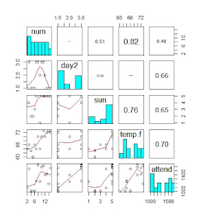
A few more data points hasn't fundamentally changed the analysis. Temperature remains the best predictor of attendance, with a correlation coefficient of 0.68. The day of the week was also a fairly strong predictor, with bigger crowds on Friday and Saturday nights than the Sunday day games and the weekday evening games. (No surprise there, really.)

I was surprised to see that attendance seemed to flag as the season went on – you can see the drop shown in the smoothing line in the plot in the lower left corner (num by attend, where num is the number of the game from 2-25). But this drop can be explained by both the day of the week and the temperature. From Monday July 29 to Thursday August 1, the temperature was 17 or 18 Celsius (62 to 63 Farenheit). On the Wednesday of this stretch (July 31), under mainly cloudy skies and the temperature at 17 Celsius (63 Farenheit), only 885 people turned up to watch the game – the only time all season the HarbourCats drew fewer than 1,000 fans to a game.

The code and data for this analysis can be found at GitHub: https://github.com/MonkmanMH/HarbourCats -30-

August 12, 2013

Ichiro: not just hits

As we count down to Ichiro's 4,000th hit (combined Nippon Professional Baseball and Major League Baseball), it's worth remembering his outstanding abilities in the field.  The best representation for my dollar is this award-winning photo captured by Scott Eklund:

Ichiro makes a leaping catch (photo: Scott Eklund; click to link)

-30-

July 18, 2013

Fair weather fans? (An R scatter plot matrix)

The Victoria HarbourCats are roughly half way through their inaugural season in the West Coast League, and currently lead the league in average attendance.  In a recent conversation with one of the team's staff, he mentioned that after the first game in early June, the fans started to come out when the sun appeared and the weather got warmer.

In spite of the very small sample size, this question presented an opportunity to teach myself how to create a scatter plot matrix in R.

The first step was to get the necessary data fields from the HarbourCats website, pulling attendance, temperature, and other information from the box score for each home game.  (Here's the box score for the team's first game, played on June 5,  2013.)

I entered the day of the week, and then coded them into 1 = Monday - Thursday, 2 = Sunday, and 3 = Friday & Saturday.  I also thought whether it was a day game or played in the evening might matter, so I coded them as 0 =  afternoon and 1 = evening (but so far, the only day games have been the two Sunday games).  The amount of sun in the sky was taken from the description in the box score, and coded as 1 = cloudy, 2 = mostly cloudy, 3 = partly cloudy, 4 = mostly sunny, and 5 = sunny.  I entered the temperature as both Celsius and Fahrenheit, and made additional notes about the game such as opening night.  And finally, there's a variable "num" which is the number of the game (e.g. 15 is the 15th home game of the season.)  The data table is here (Google drive).

First up was to run a quick line plot, to look at the variation in attendance as the season has progressed.

# ######################
# HARBOURCATS ATTENDANCE
# ######################
#
# data: pulled from www.harbourcats.com
# saved on Google Drive:
# https://docs.google.com/spreadsheet/ccc?key=0Art4wpcrwqkBdHZvTUFzOUo5U3BzMHFveXdYOTdTWUE&usp=sharing
# File / Download as >> Comma Separated Values (CSV)
#
# read the csv file
HarbourCat.attend <- read.csv("HarbourCat_attendance - Sheet1.csv")
#
# load ggplot2
if (!require(ggplot2)) install.packages("ggplot2")
library(ggplot2)
#
#
# #####
#
# simple line plot of data series
#
ggplot(HarbourCat.attend, aes(x=num, y=attend)) + 
    geom_point() + 
    geom_line()+
    ggtitle("HarbourCats attendance \n2013 season") +
    annotate("text", label="Opening Night", x=3, y=3050, size=3,    
      fontface="bold.italic")
#


As the plot shows, opening night was an exceptional success, with just over 3,000 baseball fans turning up to see the HarbourCats take the field for the first time.  For the purpose of this analysis, though, it's an extreme outlier and (particularly because of the extremely small sample size) it will play havoc with the correlation results; for the analysis that follows it will be removed.

The next thing that the plot shows is that the four of the five games that followed the home opener remain the lowest attendance games. The lowest attendance was June 12, when 1,003 fans turned out on a 16 degree Wednesday evening. After that, attendance has been variable, but has been generally stronger as the games moved into the later part of June and into early July.

A way to look at correlations between a variety of variables is a scatter plot matrix. For this, I turned to Recipe 5.13 of the R Graphics Cookbook by Winston Chang (who maintains the Cookbook for R site and is one of the software engineers behind the IDE RStudio, which you should use.)

Note: this analysis is over-the-top for the number of data points available!  I didn't bother to test for statistical significance.

# #####
# prune the extreme outlier that is opening night
# and structure the data so that attendance is last and will appear as the Y axis on plots
HarbourCat.attend.data <- (subset(HarbourCat.attend, num > 1, select=c(num, day2, sun, temp.f, attend)))
# print the data table to screen
HarbourCat.attend.data
#
   num day2 sun temp.f attend
2    2    1   4     64   1082
3    3    3   4     66   1542
4    4    1   2     63   1014
5    5    1   2     60   1003
6    6    1   3     66   1015
7    7    3   5     64   1248
8    8    3   5     70   1640
9    9    2   1     64   1246
10  10    3   5     70   1591
11  11    3   5     73   1620
12  12    2   5     70   1402
13  13    1   5     72   1426
14  14    1   5     73   1187
15  15    1   5     72   1574
#
# ###################
# scatter plot matrix
# ###################
#
# scatter plot matrix - simple
# (see Winston Chang, "R Graphics Cookbook", recipe 5.13)
pairs(HarbourCat.attend.data[,1:5])

Simple scatter plot matrix


The "pairs" function used above creates a simple scatter plot matrix, with multiple X-Y plots comparing all of the variables that have been defined.  While this is a quick way to visually check to see if there are any relationships, it is also possible to create a more complex scatter plot matrix, with the correlation coefficients and a histogram showing the distribution of each variable.  (And to the histogram, I'll also add a loess trend line.) For exploratory data analysis, this is much more valuable.


# #####
#
# scatter plot matrix - with correlation coefficients
# define panels (copy-paste from the "pairs" help page)
panel.cor <- function(x, y, digits = 2, prefix = "", cex.cor, ...)
{
    usr <- par("usr"); on.exit(par(usr))
    par(usr = c(0, 1, 0, 1))
    r <- abs(cor(x, y))
    txt <- format(c(r, 0.123456789), digits = digits)[1]
    txt <- paste0(prefix, txt)
    if(missing(cex.cor)) cex.cor <- 0.8/strwidth(txt)
    text(0.5, 0.5, txt, cex = cex.cor * r)
}
#
panel.hist <- function(x, ...)
{
    usr <- par("usr"); on.exit(par(usr))
    par(usr = c(usr[1:2], 0, 1.5) )
    h <- hist(x, plot = FALSE)
    breaks <- h$breaks; nB <- length(breaks)
    y <- h$counts; y <- y/max(y)
    rect(breaks[-nB], 0, breaks[-1], y, col = "cyan", ...)
}
#
pairs(HarbourCat.attend.data[,1:5], upper.panel = panel.cor,
                                    diag.panel = panel.hist,
                                    lower.panel = panel.smooth)


Fully loaded scatter plot matrix

What we see from this plot is that attendance is most strongly correlated with temperature -- a correlation coefficient of 0.70.  (Before you jump to any conclusions:  did I mention the extremely small sample size?!?) There are also moderately strong correlations with the sunniness of the day, and whether the game was played mid-week, Sunday, or Friday/Saturday.  In summary, attendance has been highest on warm days played on a Friday or Saturday evening, and on cool mid-week days have seen the lowest attendance.  (Are we surprised by this?)

With more sunny warm weather in the forecast we can only hope that the correlation with attendance continues through the remainder of the season.  The schedule looks favourable for high attendance, too -- they've got four mid-week games, three Sunday matinees (including the last game of the season), and six Friday-Saturday games.

When the season is concluded and more data points are added to the data set, I will revisit this analysis.

-30-

June 30, 2013

Victoria baseball history

The history of baseball in Victoria, British Columbia has many interesting stories (as well as a statistical legacy). As Tom Hawthorn notes in this great overview of professional baseball in Victoria, on the surface the city seems much more like a cricket and rugby town.  But baseball goes back a long way, with a lot of colourful characters.

Hawthorn penned a similar piece for the Globe & Mail ten years ago, which contains more details about the single appearance of the subject of "the greatest baseball card ever made".

Bill Murray, Victoria Mussels infielder


-30-

June 16, 2013

Annotating select points on an X-Y plot using ggplot2

or, Is the Seattle Mariners outfield a disaster?

The Backstory
Earlier this week (2013-06-10), a blog post by Dave Cameron appeared at USS Mariner under the title “Maybe It's Time For Dustin Ackley To Play Some Outfield”. In the first paragraph, Cameron describes to the Seattle Mariners outfield this season as “a complete disaster” and Raul Ibanez as “nothing short of a total disaster”.

To back up the Ibanez assertion, the article included a link to a Fangraphs table showing the defensive metrics for all MLB outfielders with a minimum of 200 innings played to date, sorted in ascending order of UZR.150 (UZR is generally recognized as the best defensive metric). And there, at the top (or bottom) of the list, Raul Ibanez.

But surely, I thought, Ibanez's offensive production – starting with the 11 home runs he had hit at the time, now up to 13 – off-sets to some degree the lack of defense. So I took a look at a variety of offensive measures, to see how Ibanez stacks up. It quickly struck me that wRAA (Weighted Runs Above Average), the offensive component of WAR (Wins Above Replacement, the best comprehensive measure of a player's overall contribution, which also includes a base running not examined here), would make an interesting scatterplot against UZR. And a great opportunity to use ggplot2.

Manipulating the data
Using this table from Fangraphs (advanced batting stats of all MLB players so far this season), I created a new table “outfield” that appended the advanced hitting stats to the defensive stats in the original table, and then set about creating the plot using the ggplot2 package in R.

Note: once I had downloaded the two Fangraphs tables as csv files (with results through 2013-06-15), I edited the file names slightly.

# load the ggplot2 and grid packages
library(ggplot2)
library(grid)
# read data (note csv files are renamed)
tbl1 = read.csv("FanGraphs_Leaderboard_h.csv")
tbl2 = read.csv("FanGraphs_Leaderboard_d.csv")
# create new table with data from both tbl1 and tbl2 by link on variable
# 'playerid'
outfield = data.frame(merge(tbl1, tbl2, by = "playerid"))
# clean up the variable names of the two Name fields
names(outfield)[2] = paste("Name")
names(outfield)[21] = paste("Name.y")
#


A quick plot
With the two data sets now merged, we can start plotting the results. First of all, a quick plot using ggplot2's “qplot” needs only one line of code, and three specifications (X axis data, Y axis data, and the name of the source table):

  qplot(UZR.150, wRAA, data = outfield)


So that must be Raul Ibanez over there on the far left. It's clear from this plot that his hitting (represented on the Y axis) is just above the 0 line, and a long way below the outfielders who are hitting up a storm. It's worth keeping in mind that Ibanez's hitting contribution is helped to some degree by the fact that just over one-third of his plate appearances so far this year (126 of 187) have been as a designated hitter or pinch hitter.

In looking at this plot, you might ask the same thing I did: Where are the rest of the Mariners outfielders, and who are the stars of the X and Y axes?

Code to set up the tables for plotting

The next chunk of code takes three approaches to identifying groups and individuals on the chart. We don't want to plot the names of all 110 players, that would be utterly illegible. Instead, we'll focus on three groups: the Seattle Mariners, the top UZR.150 players, and the top wRAA players. The Mariners player points and names will be navy blue, and others in black. The code will label the Mariners players and the top performers on the wRAA axis automatically, and a manual approach will be adopted to create the code necessary to identify the top UZR players.

But before plotting the results, new variables in the “outfield” table are created that have the names of the Mariners players, the UZR stars, and the wRAA stars.

# create new MarinerNames field that contains only the name of Mariners
# players (plagarized from Winston Chang's R Graphics Cookbook Recipe 5.11)
outfield$MarinerNames = outfield$Name
idx = (outfield$Team.x == "Mariners")
outfield$MarinerNames[!idx] = NA
# create a new table, taking a subset that has only the Mariners players
Mariners = subset(outfield, Team.x == "Mariners")
# add the names of the UZR stars to outfield$Table2 sort the table by
# wRAA, then add the names of the top 4 wRAA stars
outfield$wRAAstars = outfield$Name
outfield = outfield[order(-outfield$wRAA), ]
outfield$wRAAstars[5:110] = NA
# sort the table by UZR.150, then copy the first 3 names
outfield$UZRstars = outfield$Name
outfield = outfield[order(-outfield$UZR.150), ]
outfield$UZRstars[4:110] = NA
#


The final plot code
# the full ggplot verion, creating an object called "WARcht"
WARcht = ggplot(outfield, aes(x=UZR.150, y=wRAA)) + #
   geom_point(colour="gray60", size=2.0) + # set the colour and size of the points
   theme_bw() + # and use the "background white" theme
   ggtitle("Everyday Outfielders, 2013 [to 2013-06-15]") # and put a title on the plot
#
# start with WARcht, add geom_text() [for auto labels] and annotate() [for manual labels and arrows]
#
#
WARcht + # print the chart object
   geom_text(aes(label=MarinerNames), size=4, fontface="bold", colour="navyblue",
      vjust=0, hjust=-0.1) + # add the names of the Mariners players
   geom_text(aes(label=wRAAstars), size=3, fontface="bold",
      vjust=0, hjust=-0.1) + # add the names of the top wRAA players
   annotate("text", label="Shane Victorino", x=40, y=3, size=3, 

      fontface="bold.italic") + # manually place the label for Shane Victorino
   annotate("segment", x=50, y=2, xend=51.7, yend=-0.4, size=0.5,
      arrow=arrow(length=unit(.2, "cm"))) + # manually place the Victorino arrow
   annotate("text", label="Craig Gentry", x=40, y=-7.0, size=3,

      fontface="bold.italic") +
   annotate("segment", x=42, y=-6.6, xend=40.9, yend=-4.0, size=0.5, 

      arrow=arrow(length=unit(.2, "cm"))) +
   annotate("text", label="A.J. Pollock", x=49, y=-2.5, size=3,    

      fontface="bold.italic") +
   geom_point(data=Mariners, aes(x=UZR.150, y=wRAA), colour="navyblue", size=4) # over-plot the points for the Mariners players


The final analysis

In addition to Raul Ibanez, there are four other Mariners outfielders who have logged more than 200 innings. The only one on the plus side of the UZR.150 ledger is Jason Bay, at 5.5. And along with Ibanez, only Michael Morse has a positive wRAA. Put it another way, all five are more or less in the lower right-hand quadrant of the chart. So yes, it's a fair assessment that the Mariners outfield is a disaster.

The Major League outfielders who are the top hitters (the Y axis on the chart) are led by the Rockies' Carlos Gonzalez (at 28.1), ahead of Shin-Soo Choo (21.2) and Mike Trout (19.8). And defensively (the X axis), Shane Victorino leads with 51.9, followed by Craig Gentry (40.9) and A.J. Pollock (39.1).

The only outfielder who shines on both dimensions is the Brewers' Carlos Gomez, who stands in fourth place on both UZR.150 and wRAA. As the chart shows, so far this season he's in a class by himself.

Note: the code above can be found in a gist at github.

-30-

June 4, 2013

Major League Baseball run scoring trends with R's Lahman package

The statistical software R has an ever-expanding array of packages that provide pre-programmed functions and datasets. One such package is named Lahman, bundling the contents of the Lahman database into a quick-and-easy resource for R users. In addition to the data tables, the package resources also contain a variety of analyses and graphics undertaken using the package, providing some examples of how the package can be used.

Full disclosure: I am now one of the Lahman package project members.

This is my first blog post using the Lahman package, and as a first step I will simply recreate the league run scoring trends graphs that I generated previously. Originally, I had used data from Baseball Reference, for the simple reason that the Lahman database does not, in its source form, contain any league-level aggregations.

The process for loading the Lahman package is as simple as any other R package; this simplicity is even greater if you are using an IDE such as RStudio. Once loaded, you have access to all the tables in the database, without any of the futzing that is sometimes required in tidying up a raw flat file (I find that variable names are sometimes lost or changed in translation).

The code (available as a gist here, downloadable as an R script file) creates a pair of tables, calculating each league's run scoring rates by year. Then, recycling my earlier code, it calculates a series of trend lines using the loess method, and graphs those trend lines. For simplicity's sake, only the final version of each graph is shown.

Step 1: install the package (if you haven't already), access the library, and load the data table “Teams”.


# load the package into R, and open the data table 'Teams' into the
# workspace
library("Lahman")
data(Teams)
#

The second step is to use the individual team season results to calculate the aggregate of each league's year. We start with 1901, the year the American League was formed. Once those tables are created, the loess function is used to calculate trend lines for each league's run scoring environment.

# ===== CREATE LEAGUE SUMMARY TABLES
# 
# select a sub-set of teams from 1901 [the establishment of the American
# League] forward to 2012
Teams_sub <- as.data.frame(subset(Teams, yearID > 1900))
# calculate each team's average runs and runs allowed per game
Teams_sub$RPG <- Teams_sub$R/Teams_sub$G
Teams_sub$RAPG <- Teams_sub$RA/Teams_sub$G
# create new data frame with season totals for each league
LG_RPG <- aggregate(cbind(R, RA, G) ~ yearID + lgID, data = Teams_sub, sum)
# calculate league + season runs and runs allowed per game
LG_RPG$LG_RPG <- LG_RPG$R/LG_RPG$G
LG_RPG$LG_RAPG <- LG_RPG$RA/LG_RPG$G
# select a sub-set of teams from 1901 [the establishment of the American
# League] forward to 2012 read the data into separate league tables
ALseason <- (subset(LG_RPG, yearID > 1900 & lgID == "AL"))
NLseason <- (subset(LG_RPG, yearID > 1900 & lgID == "NL"))
#
# ===== TRENDS: RUNS SCORED PER GAME
# 
# AMERICAN LEAGUE create new object ALRunScore.LO for loess model
ALRunScore.LO <- loess(ALseason$LG_RPG ~ ALseason$yearID)
ALRunScore.LO.predict <- predict(ALRunScore.LO)
# create new objects RunScore.Lo.XX for loess models with 'span' control
# span = 0.25
ALRunScore.LO.25 <- loess(ALseason$LG_RPG ~ ALseason$yearID, span = 0.25)
ALRunScore.LO.25.predict <- predict(ALRunScore.LO.25)
# span = 0.5
ALRunScore.LO.5 <- loess(ALseason$LG_RPG ~ ALseason$yearID, span = 0.5)
ALRunScore.LO.5.predict <- predict(ALRunScore.LO.5)
# NATIONAL LEAGUE create new object RunScore.LO for loess model
NLRunScore.LO <- loess(NLseason$LG_RPG ~ NLseason$yearID)
NLRunScore.LO.predict <- predict(NLRunScore.LO)
# loess models
NLRunScore.LO.25 <- loess(NLseason$LG_RPG ~ NLseason$yearID, span = 0.25)
NLRunScore.LO.25.predict <- predict(NLRunScore.LO.25)
NLRunScore.LO.5 <- loess(NLseason$LG_RPG ~ NLseason$yearID, span = 0.5)
NLRunScore.LO.5.predict <- predict(NLRunScore.LO.5)
#

Now that we have calculated the league averages and trend lines (using the loess method), we can start the plots. First, a simple plot of the actual values:

# MULTI-PLOT -- MERGING AL AND NL RESULTS plot individual years as lines
ylim <- c(3, 6)
# start with AL line
plot(ALseason$LG_RPG ~ ALseason$yearID, type = "l", lty = "solid", col = "red", 
    lwd = 2, main = "Runs per team per game, 1901-2012", ylim = ylim, xlab = "year", 
    ylab = "runs per game")
# add NL line
lines(NLseason$yearID, NLseason$LG_RPG, lty = "solid", col = "blue", lwd = 2)
# chart additions
grid()
legend(1900, 3.5, c("AL", "NL"), lty = c("solid", "solid"), col = c("red", "blue"), 
    lwd = c(2, 2))


Next, comparing the league trends.

# plot multiple loess curves (span=0.50 and 0.25)
ylim <- c(3, 6)
# start with AL line
plot(ALRunScore.LO.5.predict ~ ALseason$yearID, type = "l", lty = "solid", col = "red", 
    lwd = 2, main = "Runs per team per game, 1901-2012", ylim = ylim, xlab = "year", 
    ylab = "runs per game")
# add NL line
lines(NLseason$yearID, NLRunScore.LO.5.predict, lty = "solid", col = "blue", 
    lwd = 2)
# add 0.25 lines
lines(ALseason$yearID, ALRunScore.LO.25.predict, lty = "dashed", col = "red", 
    lwd = 2)
lines(NLseason$yearID, NLRunScore.LO.25.predict, lty = "dashed", col = "blue", 
    lwd = 2)
# chart additions
legend(1900, 3.5, c("AL (span=0.50)", "NL (span=0.50)", "AL (span=0.25)", "NL (span=0.25)"), 
    lty = c("solid", "solid", "dashed", "dashed"), col = c("red", "blue", "red", 
        "blue"), lwd = c(2, 2, 2, 2))
grid()


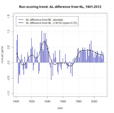
Next, calculate the difference between the two leagues – both the absolute difference and the difference in the loess trend lines.

# 1. absolute
RunDiff <- (ALseason$LG_RPG - NLseason$LG_RPG)
# 2. LOESS span=0.25
RunDiffLO <- (ALRunScore.LO.25.predict - NLRunScore.LO.25.predict)
#

And plot the differences.

# plot each year absolute difference as bar, difference in trend as line
ylim <- c(-1, 1.5)
plot(RunDiff ~ ALseason$yearID, type = "h", lty = "solid", col = "blue", lwd = 2, 
    main = "Run scoring trend: AL difference from NL, 1901-2012", ylim = ylim, 
    xlab = "year", ylab = "runs per game")
# add RunDiff line
lines(ALseason$yearID, RunDiffLO, lty = "solid", col = "black", lwd = 2)
# add line at zero
abline(h = 0, lty = "dotdash")
# chart additions
grid()
legend(1900, 1.5, c("AL difference from NL: absolute", "AL difference from NL, LOESS (span=0.25)"), 
    lty = c("solid", "solid"), col = c("blue", "black"), lwd = c(2, 2))
#


For the next “using R” post, I'll take a look at the ways to plot the residuals from the loess method.

The one after that: ggplot2 versions of the graphs.

-30-

April 5, 2013

Strikeout rates - update

Just a quick follow-up from my earlier post:  James Gentile at Beyond the Boxscore has written another great analysis on strikeouts, this one with the title "How can strikeouts be great for pitchers, but not that bad for hitters?" The analysis delves deeper in the question of increased strikeout rates by looking at the asymmetry between pitcher and hitter outcomes.

It boils down to this sentence: "Over time, hitters, managers, and front offices have slowly recognized more and more that they can trade additional strikeouts for an increase in production at the plate with very little repercussions."

-30-

March 29, 2013

On strikeout rates

A couple of recent articles have looked into the increased rate of strikeouts per game.

In the New York Times, Tyler Kepner has an article titled "Swing and a Mystery: Strikeout Rates Are Soaring".  This one has a sidebar article "Strikeouts on the rise", which includes an interactive chart displaying the changes over time (including an optional overlay for a selected team).

Some explanations offered--none conclusively--include increased use of relief pitchers, batters are more likely to swing aggressively with two strikes, better information available to pitchers, and pitchers throwing more strikes (walk rates are the lowest they have been in 20 years).


At Beyond The Boxscore (part of SB Nation), James Gentile takes a look at the rise of the called strike. Gentile notes that pitches per plate appearance (PA) have risen, and it's been called strikes and foul strikes per PA, not swinging strikes, that have risen. Gentile suggests (in common with some of Kepner's ideas) that batters are being less aggressive, and more patient.

So far, the research is only scratching the surface.  I'm sure we will see more in the future.

-30-

February 24, 2013

MLB runs allowed by team

Or, How good were the Maddux/Glavine-era Braves?

In this on-going series of posts about run scoring in Major League Baseball, for this installment I'll turn the equation around and look at runs allowed.  In order to account for the changing run scoring environments, the runs allowed by individual teams is compared to the league average for that season, creating an index where 100 is the league average. In this formulation, a score below 100 is a good thing; a team with an index score of 95 allowed runs at a rate 5 percentage points below the league average.

Having written the original code in R, it's now a very simple process to change a few variable names and create the equivalent of the earlier runs scored analysis, but looking at runs allowed. This is one of the most important benefits of a code/syntax environment, an option that doesn't exist if  you are using a point-and-click GUI interface.

February 23, 2013

Sabermetrics primer

Phil Birnbaum, author of the Sabermetric Research and the editor of SABR's "By the Numbers", has written a primer on the topic with the title "A Guide to Sabermetric Research" that appears at the SABR site. This should be the first stop for anyone who wants to find out more about the field of sabermetrics, and a good read for those already active.

-30-

February 17, 2013

Run production, one team at a time


In a previous post, I used R to process data from the Lahman database to calculate index values that compare a team's run production to the league average for that year.  For the purpose of that exercise, I started the sequence at 1947, but for what follows I re-ran the code with the time period 1901-2012.

The R code I used can be found at this Github gist. Instead of boring you here with the ins and outs of what the code is doing, I've embedded that as documentation in the gist. The R code assumes that you've got a data frame called "Teams.merge" already in your workspace.  This can be achieved by running the previous code, or if you've done that before, you'll have created a csv file with the name "Teams.merge.csv", and now have the option to read that file as a data frame "Teams.merge".

The first step is to choose one of the current teams, and create a data frame that contains just that club's history.  Once this has been done, the code then creates trend lines (using the LOESS method, as I did with the leagues in previous posts), and then plot them.