June 2, 2019

Same name, different bird

What do we mean when we see a bird and say that it’s a robin? A simple description would be a small brownish bird with a red breast. But that’s a superficial description, and when we say “robin” what we mean depends on your location; you don’t have to look very closely to see that the European and American robins are fundamentally different.

European robin


The European robin (Erithacus rubecula) is an Old World flycatcher, catching insects on the wing. (Image source: Wikipedia)

North American robin


The American robin (Turdus migratorius) is a thrush, and eats earthworms and other invertebrates, along with fruits and berries. (Image source: Wikipedia)

(The naming of the American robin is a classic case of “The Captain’s Hat”; European explorers and colonists arriving in other parts of the world and naming things in a way that reflected their existing knowledge and preconceptions.)


Similarly, what do we mean when we say “data scientist”?

Here’s a tweet by JD Long:
The second tweet in his thread was the one that caught my attention:
A reply in the thread linked to Eric Colson’s paper at HBR (2019-03-08), Why Data Science Teams Need Generalists, Not Specialists, which provides a compelling argument that the generalist data scientist provides significant value to the organization, particularly small organizations.

Explicit in both Long and Colson’s statements is that there are two different types of data scientists: the generalist and the specialist.

I want to go further in refining this typology, and postulate (based on my own anecdotal observations) some of the differences between the two.

Generalists


Generalists can be found, as JD Long has noted, in smaller organizations.

The academic backgrounds of data scientists tend to be Statistics (as a discipline), or they are people with a quantitative bent from (for want of a better term) subject matter disciplines, such as Astronomy, Economics, Geography, and Psychology.

This tends to position them smack dab in the middle of Drew Conway’s famous Data Science Venn diagram:


These generalist data scientists bring subject matter expertise, foundational statistical knowledge, and some pragmatic programming skills.

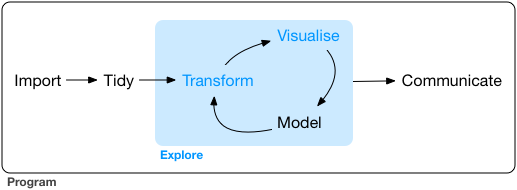
The work of the generalist tends to follow the full sequence of a typical data science project as envisioned by Grolemund and Wickham in R for Data Science:


I would go further, and argue that data scientists can (and perhaps should!) be involved earlier in the process, providing insights and expertise to the framing of the research question and the data collection phase. I am supported in this way of thinking by Stephanie Hicks and Roger Peng, whose recent paper “Elements and Principles of Data Analysis” (2019-03-18) includes the following definition of data science:
Data science is the science and design of (1) actively creating a question to investigate a hypothesis with data, (2) connecting that question with the collection of appropriate data and the application of appropriate methods, algorithms, computational tools or languages in a data analysis, and (3) communicating and making decisions based on new or already established knowledge derived from the data and data analysis. (p.2)
And following this line of thinking, I have observed that generalist data scientists tend to favour R as their tool of choice. Roger Peng (a biostatistician) has said “The R programming language has become the de facto programming language for data science.” R was developed first as a programming environment in which to do statistics, so many of the defaults and behaviours are optimized around how statisticians and subject-matter practitioners tend to think about their data analysis problem.

R’s foundational data structures are mathematical and statistical in nature: vectors, matricies, and data frames. As well, base R has a plethora of statistical functionality built in–t tests, regression models, statistical distributions, and so on.

Specialists


The specialist data scientist is a different creature. They tend to have a degree in Computer Science or Computational Statistics, often at the graduate level. In Drew Conway’s Venn diagram, they tend to be very deep on the “hacking skills”, with less emphasis on the statistics (as a discipline) or subject matter expertise.

Their work seems to fall largely on the “exploration” phases, with a strong emphasis on the “modeling” part of the data science process. They work with tidy, pre-processed data, often as part of an automated data processing flow from collection through analysis and modeling, to communication (which might also included automated feedback to points earlier in the process).

Because of their computer science backgrounds, these data scientists, in general, favour Python as their programming environment of choice. Python is a programming language first, to which data analytics packages (such as the {pandas} data analysis package) has been added.

Roger Peng and Hilary Parker touch on these differences in their podcast Not So Standard Deviations 81. Their nomenclature uses “statistician” for what I’ve called “generalist”, and “data scientist” for “specialist”. Starting at 25’ 00" through 30’ 00“, they first discuss sampling and how that’s not something that a specialist would think about (supporting my contention that the specialist emphasis is not on tried-and-true statistical methods). Peng summarizes the”data science mindset" regarding sampling as follows:
"If I use all the data then I’m doing Big Data, but if I’m sampling then I’m just a Statistician."
Hilary Parker adds another dimension to the typology:
Data scientists working in tech…are really quick to say “I need to spin up this infrastructure to do this”. [They ask] “What big data tool can deal with this problem?”, rather than [what a statistician might ask] “Does the confidence interval really need to be this small for this application?” And [for specialists] there’s a certain joy with building out the infrastructure.
Kareem Carr goes further, and parses what I’ve described as a dichotomy into four separate categories:

If I am interpreting this correctly, in my typology the “big data” and “machine learning” are part of the specialist group, and “data science” and “statistics” are generalists.


Summary


Characteristic Generalist Specialist
academic background Statistics, social science, physical science Computer Science, Computer Engineering, Computational Statistics
Venn diagram emphasis subject matter, statistics hacking
Data science project start-to-finish exploration
language R Python


The view from a small organization


I work in a small data analytics organization, and lead a crack team of data scientists. We all fit the “generalist” typology–although computer science courses have been part of our training, we don’t hold degrees in that area.

An example of our workflow can be shown in the example of an employee survey that we conduct.
Our process used to look like this:


modified from Andy Teucher and Stephanie Hazlitt

Data was extracted from the human resources database; we relied on database administrators from outside our organization to do this for us. This data was the basis of the survey frame, which was used in our survey software to administer the survey; the survey data then flowed into SPSS, where it was joined with demographic values pulled from the HR database. Manipulation and modelling occurred in three programs: SPSS, Excel, and Stata.

The reporting to the clients was in the form of summary tables in Excel, along with PDF versions of documents written in Word. It’s worth noting that programmers outside the organization were responsible for automating the production of these Excel and PDF outputs, which have consistent structure and vary only by department.

Now it looks like this:


modified from Andy Teucher and Stephanie Hazlitt

The data scientists in our organization have written (in R) code that pulls the extract from the database; this data is used to build the survey frame. The survey is deployed to collect the data, and then R is used to wrangle and model the survey responses–work that was previously done in a variety of other tools. The data scientists have also written R code which creates a variety of outputs including Excel (using the {xlsx} package), PDF, and (coming soon) web-based reports (using Shiny).

In a large organization, pin factory efficiencies would have led to specialization at every step of this workflow, but in our small shop, it’s extremely beneficial. It’s certainly working for us; reducing our reliance and interactions with specialized IT resources (i.e. our transaction costs) has improved our efficiencies. As well, I agree with Eric Colson's observation that these generalized roles "better facilitate learning and innovating."

A biased view


There is significant bias in the Euro- and North American-centric definition of what defines a “robin”. And my view of what defines a “data scientist” might also be too narrow, in the same way that there is a Japanese robin and a Siberian blue robin.

Siberian blue robin

-30-

February 25, 2019

MLB run scoring trends: Shiny app update

The new Major League Baseball season will soon begin, which means it’s time to look back and update my run scoring trends data visualization application, built using RStudio’s shiny package.
You can find the app here: https://monkmanmh.shinyapps.io/MLBrunscoring_shiny/
The github repo for this app is https://github.com/MonkmanMH/MLBrunscoring_shiny
This update gave me the opportunity to make some cosmetic tweaks to the front end, and more consequential changes to the code under the hood.

1. retired reshape, using tidyr

At one point in the app’s code, I had used the now-retired reshape package to melt a data table. Although this still works, I opted to update the code to use the gather() function in the package tidyr, part of the tidyverse.

2. feather instead of csv

The app relied on some pre-wrangled csv files; these have been replaced by files stored using the .feather format, which makes for a signficant performance improvement.

3. wrangling: the calculation of team and league run scoring averages

The goal is to create data tables that minimize the amount of processing the app has to do.
In previous versions of the app, the filtering of rows (records or observations) and selecting of columns (variables), the calculation of each team’s average runs scored and runs allowed per game, the league average runs per game, and the comparison of the team to the league, was done first using base R’s apply family of functions.
Then I switched to using dplyr, and although the steps were now in a pipe, this approach still required creating a separate data table with the league average, and then joining that table back into the main team table so that the team result could be compared to the league average.
For this iteration, preparing the data for the app is now done using tidyr::nest() and purrr::map(). What follows is a detailed explanation of how I approached this.
It’s always valuable to have your end-state in mind when working through a multi-step data wrangle like this. My goal is the values shown on the “team plot” tab of the app – an index value (i.e. a percentage) of a team’s average runs scored (and runs allowed) compared to the league run scoring rate, for a single season.

a. Load packages and read the data

First, load the necessary packages, the first four of which are part of the tidyverse.
# tidyverse packages
library(dplyr)
library(purrr)
library(readr)
library(tidyr)

library(feather)
Then, read in the data.
Teams <- read_csv("Teams.csv",
                  col_types = cols(
                    divID = col_character(),
                    DivWin = col_character(),
                    SF = col_character(),
                    WCWin = col_character()
                  ))

head(Teams)
## # A tibble: 6 x 48
##   yearID lgID  teamID franchID divID  Rank     G Ghome     W     L DivWin
##    <dbl> <chr> <chr>  <chr>    <chr> <dbl> <dbl> <dbl> <dbl> <dbl> <chr> 
## 1   1871 <NA>  BS1    BNA      <NA>      3    31    NA    20    10 <NA>  
## 2   1871 <NA>  CH1    CNA      <NA>      2    28    NA    19     9 <NA>  
## 3   1871 <NA>  CL1    CFC      <NA>      8    29    NA    10    19 <NA>  
## 4   1871 <NA>  FW1    KEK      <NA>      7    19    NA     7    12 <NA>  
## 5   1871 <NA>  NY2    NNA      <NA>      5    33    NA    16    17 <NA>  
## 6   1871 <NA>  PH1    PNA      <NA>      1    28    NA    21     7 <NA>  
## # ... with 37 more variables: WCWin <chr>, LgWin <chr>, WSWin <chr>,
## #   R <dbl>, AB <dbl>, H <dbl>, `2B` <dbl>, `3B` <dbl>, HR <dbl>,
## #   BB <dbl>, SO <dbl>, SB <dbl>, CS <dbl>, HBP <dbl>, SF <chr>, RA <dbl>,
## #   ER <dbl>, ERA <dbl>, CG <dbl>, SHO <dbl>, SV <dbl>, IPouts <dbl>,
## #   HA <dbl>, HRA <dbl>, BBA <dbl>, SOA <dbl>, E <dbl>, DP <dbl>,
## #   FP <dbl>, name <chr>, park <chr>, attendance <dbl>, BPF <dbl>,
## #   PPF <dbl>, teamIDBR <chr>, teamIDlahman45 <chr>, teamIDretro <chr>
The table above has far more variables than what we need, and some that we’ll have to calculate.

b. Create league summary tables

A short set of instructions that starts with the “Teams” table in the Lahman database and summarizes it for MLB run scoring trends Shiny app
Thus rather than having the app do the work of
  1. remove unnecessary records (rows) and fields (columns) and
  2. run the calculations for the runs-per-game, runs-allowed-per-game, and indexed versions of those,
the calculations are conducted here. This will vastly improve the performance of the app.

i. create nested table

I started with the “Many Models”" chapter of Wickham and Grolemund, R for Data Science. (And thanks to Dr. Charlotte Wickham, whose training course was invaluable in helping me wrap my head around this.)
At this point, the code
  • filters out the years prior to 1901 and the misbegotten Federal League.
  • and then creates a nested data table, starting with the group_by() year and league (lgID)
# select a sub-set of teams from 1901 [the establishment of the American League] forward to most recent year
Teams_lgyr <- Teams %>%
  filter(yearID > 1900, lgID != "FL") %>%
  group_by(yearID, lgID) %>%
  nest()

Teams_lgyr
## # A tibble: 236 x 3
##    yearID lgID  data             
##     <dbl> <chr> <list>           
##  1   1901 AL    <tibble [8 x 46]>
##  2   1901 NL    <tibble [8 x 46]>
##  3   1902 AL    <tibble [8 x 46]>
##  4   1902 NL    <tibble [8 x 46]>
##  5   1903 AL    <tibble [8 x 46]>
##  6   1903 NL    <tibble [8 x 46]>
##  7   1904 AL    <tibble [8 x 46]>
##  8   1904 NL    <tibble [8 x 46]>
##  9   1905 AL    <tibble [8 x 46]>
## 10   1905 NL    <tibble [8 x 46]>
## # ... with 226 more rows
Here’s a quick peek inside the first entry of the “data” column…the American League, 1901.
Teams_lgyr$data[[1]]
## # A tibble: 8 x 46
##   teamID franchID divID  Rank     G Ghome     W     L DivWin WCWin LgWin
##   <chr>  <chr>    <chr> <dbl> <dbl> <dbl> <dbl> <dbl> <chr>  <chr> <chr>
## 1 BLA    NYY      <NA>      5   134    66    68    65 <NA>   <NA>  N    
## 2 BOS    BOS      <NA>      2   138    69    79    57 <NA>   <NA>  N    
## 3 CHA    CHW      <NA>      1   137    71    83    53 <NA>   <NA>  Y    
## 4 CLE    CLE      <NA>      7   138    69    54    82 <NA>   <NA>  N    
## 5 DET    DET      <NA>      3   135    70    74    61 <NA>   <NA>  N    
## 6 MLA    BAL      <NA>      8   139    70    48    89 <NA>   <NA>  N    
## 7 PHA    OAK      <NA>      4   137    66    74    62 <NA>   <NA>  N    
## 8 WS1    MIN      <NA>      6   138    68    61    72 <NA>   <NA>  N    
## # ... with 35 more variables: WSWin <chr>, R <dbl>, AB <dbl>, H <dbl>,
## #   `2B` <dbl>, `3B` <dbl>, HR <dbl>, BB <dbl>, SO <dbl>, SB <dbl>,
## #   CS <dbl>, HBP <dbl>, SF <chr>, RA <dbl>, ER <dbl>, ERA <dbl>,
## #   CG <dbl>, SHO <dbl>, SV <dbl>, IPouts <dbl>, HA <dbl>, HRA <dbl>,
## #   BBA <dbl>, SOA <dbl>, E <dbl>, DP <dbl>, FP <dbl>, name <chr>,
## #   park <chr>, attendance <dbl>, BPF <dbl>, PPF <dbl>, teamIDBR <chr>,
## #   teamIDlahman45 <chr>, teamIDretro <chr>

ii - functional programming

This step creates a league run scoring function, and then applies that using the purrr::map() function.
Note:
  • In the gapminder example in R for Data Science, the variables were called using their names. In this case, for a reason I have not yet determined, we have to specify the data object they are coming from; e.g. for the runs variable R, we have to use df$R (not just R).
First, a simple test, calculating runs scored, and checking to see if we got the right answer, b comparing that to the value calculated using dplyr:
# base R format
leagueRuns_fun <- function(df) {
  sum(data = df$R)
}

league_year_runs <- map(Teams_lgyr$data, leagueRuns_fun)

league_year_runs[[1]]
## [1] 5873
#check the answer by old school `dplyr` method
Teams %>%
  filter(yearID == 1901,
         lgID == "AL") %>%
  summarise(leagueruns = sum(R))
## # A tibble: 1 x 1
##   leagueruns
##        <dbl>
## 1       5873
Now we move on to the calculation of league averages.
For the first approach, the sum calculation is part of the function.
  • There are two functions, one for Runs and the other for Runs Allowed. This is because I have not yet figured out how to specify two different variables (i.e. the name of the data object and the variable to be used in the function) in the map_() function and successfully have them carried into my calculation functions
  • Also note that in order to be consistent with other sources, the number of games played is calculated using the sum of wins (W) and losses (L), rather than the number of games reported in the G variable.
# functions
leagueRPG_fun <- function(df) {
  sum(data = df$R) / (sum(data = df$W) + sum(data = df$L))
  }

leagueRAPG_fun <- function(df) {
  sum(data = df$RA) / (sum(data = df$W) + sum(data = df$L))
  }


# simple `map` version
league_year_RPG <- map(Teams_lgyr$data, leagueRPG_fun)

# embed as new columns in nested data object
Teams_lgyr <- Teams_lgyr %>%
  mutate(lgRPG = map_dbl(Teams_lgyr$data, leagueRPG_fun),
         lgRAPG = map_dbl(Teams_lgyr$data, leagueRAPG_fun))

Teams_lgyr
## # A tibble: 236 x 5
##    yearID lgID  data              lgRPG lgRAPG
##     <dbl> <chr> <list>            <dbl>  <dbl>
##  1   1901 AL    <tibble [8 x 46]>  5.43   5.43
##  2   1901 NL    <tibble [8 x 46]>  4.69   4.69
##  3   1902 AL    <tibble [8 x 46]>  4.97   4.97
##  4   1902 NL    <tibble [8 x 46]>  4.09   4.09
##  5   1903 AL    <tibble [8 x 46]>  4.15   4.15
##  6   1903 NL    <tibble [8 x 46]>  4.85   4.85
##  7   1904 AL    <tibble [8 x 46]>  3.65   3.65
##  8   1904 NL    <tibble [8 x 46]>  3.98   3.98
##  9   1905 AL    <tibble [8 x 46]>  3.75   3.75
## 10   1905 NL    <tibble [8 x 46]>  4.16   4.16
## # ... with 226 more rows
In the second approach:
  • the league and year total runs, runs allowed, and games are first calculated using separate functions
  • RPG and RAPG for each league and year combination are then calculated outside the nested tibbles
# more functions - individual league by year totals
leagueR_fun <- function(df) {
  sum(data = df$R)
}

leagueRA_fun <- function(df) {
  sum(data = df$RA)
}

leagueG_fun <- function(df) {
  (sum(data = df$W) + sum(data = df$L))
}


Teams_lgyr <- Teams_lgyr %>%
  mutate(lgR = map_dbl(Teams_lgyr$data, leagueR_fun),
         lgRA = map_dbl(Teams_lgyr$data, leagueRA_fun),
         lgG = map_dbl(Teams_lgyr$data, leagueG_fun))


Teams_lgyr <- Teams_lgyr %>%
  mutate(lgRPG = (lgR / lgG),
         lgRAPG = (lgRA / lgG))

Teams_lgyr
## # A tibble: 236 x 8
##    yearID lgID  data              lgRPG lgRAPG   lgR  lgRA   lgG
##     <dbl> <chr> <list>            <dbl>  <dbl> <dbl> <dbl> <dbl>
##  1   1901 AL    <tibble [8 x 46]>  5.43   5.43  5873  5873  1082
##  2   1901 NL    <tibble [8 x 46]>  4.69   4.69  5194  5194  1108
##  3   1902 AL    <tibble [8 x 46]>  4.97   4.97  5407  5407  1088
##  4   1902 NL    <tibble [8 x 46]>  4.09   4.09  4494  4494  1098
##  5   1903 AL    <tibble [8 x 46]>  4.15   4.15  4543  4543  1096
##  6   1903 NL    <tibble [8 x 46]>  4.85   4.85  5349  5349  1102
##  7   1904 AL    <tibble [8 x 46]>  3.65   3.65  4433  4433  1216
##  8   1904 NL    <tibble [8 x 46]>  3.98   3.98  4872  4872  1224
##  9   1905 AL    <tibble [8 x 46]>  3.75   3.75  4547  4547  1212
## 10   1905 NL    <tibble [8 x 46]>  4.16   4.16  5092  5092  1224
## # ... with 226 more rows

iii. save LG_RPG files

And then write csv and feather versions. As noted above, the shiny app now uses the feather format.
Notes:
  • rounding of variables after all the calculations, simply to make the tables as viewed more legible.
  • renaming of variables to correspond with shiny app names.
LG_RPG <- Teams_lgyr %>%
  mutate(lgRPG = round(lgRPG, 2),
         lgRAPG = round(lgRAPG, 2)) %>%
  select(yearID, lgID, R = lgR, RA = lgRA, G = lgG, 
         leagueRPG = lgRPG, leagueRAPG = lgRAPG)

LG_RPG
## # A tibble: 236 x 7
##    yearID lgID      R    RA     G leagueRPG leagueRAPG
##     <dbl> <chr> <dbl> <dbl> <dbl>     <dbl>      <dbl>
##  1   1901 AL     5873  5873  1082      5.43       5.43
##  2   1901 NL     5194  5194  1108      4.69       4.69
##  3   1902 AL     5407  5407  1088      4.97       4.97
##  4   1902 NL     4494  4494  1098      4.09       4.09
##  5   1903 AL     4543  4543  1096      4.15       4.15
##  6   1903 NL     5349  5349  1102      4.85       4.85
##  7   1904 AL     4433  4433  1216      3.65       3.65
##  8   1904 NL     4872  4872  1224      3.98       3.98
##  9   1905 AL     4547  4547  1212      3.75       3.75
## 10   1905 NL     5092  5092  1224      4.16       4.16
## # ... with 226 more rows
write_csv(LG_RPG, "LG_RPG.csv")
write_feather(LG_RPG, "LG_RPG.feather")

c. Repeat for MLB total

This only differs from the league summaries in the level of nesting; instead of grouping by year and league, it’s only year (yearID).
Teams_lgyr <- Teams_lgyr %>%
  unnest() %>%
  group_by(yearID) %>%
  nest()

Teams_lgyr
## # A tibble: 118 x 2
##    yearID data              
##     <dbl> <list>            
##  1   1901 <tibble [16 x 52]>
##  2   1902 <tibble [16 x 52]>
##  3   1903 <tibble [16 x 52]>
##  4   1904 <tibble [16 x 52]>
##  5   1905 <tibble [16 x 52]>
##  6   1906 <tibble [16 x 52]>
##  7   1907 <tibble [16 x 52]>
##  8   1908 <tibble [16 x 52]>
##  9   1909 <tibble [16 x 52]>
## 10   1910 <tibble [16 x 52]>
## # ... with 108 more rows
Teams_lgyr <- Teams_lgyr %>%
  mutate(mlbR = map_dbl(Teams_lgyr$data, leagueR_fun),
         mlbRA = map_dbl(Teams_lgyr$data, leagueRA_fun),
         mlbG = map_dbl(Teams_lgyr$data, leagueG_fun),
         mlbRPG = (mlbR / mlbG),
         mlbRAPG = (mlbRA / mlbG))

Teams_lgyr
## # A tibble: 118 x 7
##    yearID data                mlbR mlbRA  mlbG mlbRPG mlbRAPG
##     <dbl> <list>             <dbl> <dbl> <dbl>  <dbl>   <dbl>
##  1   1901 <tibble [16 x 52]> 11067 11067  2190   5.05    5.05
##  2   1902 <tibble [16 x 52]>  9901  9901  2186   4.53    4.53
##  3   1903 <tibble [16 x 52]>  9892  9892  2198   4.50    4.50
##  4   1904 <tibble [16 x 52]>  9305  9305  2440   3.81    3.81
##  5   1905 <tibble [16 x 52]>  9639  9639  2436   3.96    3.96
##  6   1906 <tibble [16 x 52]>  8881  8878  2416   3.68    3.67
##  7   1907 <tibble [16 x 52]>  8703  8703  2406   3.62    3.62
##  8   1908 <tibble [16 x 52]>  8422  8422  2456   3.43    3.43
##  9   1909 <tibble [16 x 52]>  8810  8810  2436   3.62    3.62
## 10   1910 <tibble [16 x 52]>  9584  9584  2446   3.92    3.92
## # ... with 108 more rows
And again, we save the files for use in the shiny app.
MLB_RPG <- Teams_lgyr %>%
  mutate(mlbRPG = round(mlbRPG, 2),
         mlbRAPG = round(mlbRAPG, 2)) %>%
  select(yearID, R = mlbR, RA = mlbRA, G = mlbG, 
         leagueRPG = mlbRPG, leagueRAPG = mlbRAPG)

write_csv(MLB_RPG, "MLB_RPG.csv")
write_feather(MLB_RPG, "MLB_RPG.feather")

d. Individual team values

Calculate index of team run scoring against league average
Note that we start with unnest() and create a new object, Teams_append … a tibble with all of the variables exposed.
Teams_append <- Teams_lgyr %>%
  unnest() %>%
  mutate(teamRPG=(R / (W + L)), 
         teamRAPG=(RA / (W + L)), 
         WLpct=(W / (W + L))) %>%
  # runs scored index where 100=the league average for that season
  mutate(R_index = (teamRPG / lgRPG) * 100) %>%
  mutate(R_index.sd = sd(R_index)) %>%
  mutate(R_z = (R_index - 100) / R_index.sd) %>%
  # runs allowed
  mutate(RA_index = (teamRAPG / lgRAPG) * 100) %>%
  mutate(RA_index.sd = sd(RA_index)) %>%
  mutate(RA_z = (RA_index - 100) / RA_index.sd) 


Teams_append
## # A tibble: 2,496 x 67
##    yearID  mlbR mlbRA  mlbG mlbRPG mlbRAPG lgID  lgRPG lgRAPG   lgR  lgRA
##     <dbl> <dbl> <dbl> <dbl>  <dbl>   <dbl> <chr> <dbl>  <dbl> <dbl> <dbl>
##  1   1901 11067 11067  2190   5.05    5.05 AL     5.43   5.43  5873  5873
##  2   1901 11067 11067  2190   5.05    5.05 AL     5.43   5.43  5873  5873
##  3   1901 11067 11067  2190   5.05    5.05 AL     5.43   5.43  5873  5873
##  4   1901 11067 11067  2190   5.05    5.05 AL     5.43   5.43  5873  5873
##  5   1901 11067 11067  2190   5.05    5.05 AL     5.43   5.43  5873  5873
##  6   1901 11067 11067  2190   5.05    5.05 AL     5.43   5.43  5873  5873
##  7   1901 11067 11067  2190   5.05    5.05 AL     5.43   5.43  5873  5873
##  8   1901 11067 11067  2190   5.05    5.05 AL     5.43   5.43  5873  5873
##  9   1901 11067 11067  2190   5.05    5.05 NL     4.69   4.69  5194  5194
## 10   1901 11067 11067  2190   5.05    5.05 NL     4.69   4.69  5194  5194
## # ... with 2,486 more rows, and 56 more variables: lgG <dbl>,
## #   teamID <chr>, franchID <chr>, divID <chr>, Rank <dbl>, G <dbl>,
## #   Ghome <dbl>, W <dbl>, L <dbl>, DivWin <chr>, WCWin <chr>, LgWin <chr>,
## #   WSWin <chr>, R <dbl>, AB <dbl>, H <dbl>, `2B` <dbl>, `3B` <dbl>,
## #   HR <dbl>, BB <dbl>, SO <dbl>, SB <dbl>, CS <dbl>, HBP <dbl>, SF <chr>,
## #   RA <dbl>, ER <dbl>, ERA <dbl>, CG <dbl>, SHO <dbl>, SV <dbl>,
## #   IPouts <dbl>, HA <dbl>, HRA <dbl>, BBA <dbl>, SOA <dbl>, E <dbl>,
## #   DP <dbl>, FP <dbl>, name <chr>, park <chr>, attendance <dbl>,
## #   BPF <dbl>, PPF <dbl>, teamIDBR <chr>, teamIDlahman45 <chr>,
## #   teamIDretro <chr>, teamRPG <dbl>, teamRAPG <dbl>, WLpct <dbl>,
## #   R_index <dbl>, R_index.sd <dbl>, R_z <dbl>, RA_index <dbl>,
## #   RA_index.sd <dbl>, RA_z <dbl>
In this the final step, we first create a new data object Teams_merge.
Notes:
  • rounding of a variety of the calculated variables, to address readability concerns.
  • selection and renaming of variables to correspond with shiny app names.
  • then write csv and feather versions.
Teams_merge <- Teams_append %>%
  mutate(lgRPG = round(lgRPG, 2),
         lgRAPG = round(lgRAPG, 2),
         WLpct = round(WLpct, 3),
         teamRPG = round(teamRPG, 2),
         teamRAPG = round(teamRAPG, 2),
         R_index = round(R_index, 1),
         RA_index = round(RA_index, 1)
         ) %>%
  select(yearID, lgID, franchID, teamID, name,
         W, L, WLpct, R.x = R, RA.x = RA, 
         teamRPG, leagueRPG = lgRPG, R_index,
         teamRAPG, leagueRAPG = lgRAPG, RA_index)

Teams_merge
## # A tibble: 2,496 x 16
##    yearID lgID  franchID teamID name      W     L WLpct   R.x  RA.x teamRPG
##     <dbl> <chr> <chr>    <chr>  <chr> <dbl> <dbl> <dbl> <dbl> <dbl>   <dbl>
##  1   1901 AL    NYY      BLA    Balt~    68    65 0.511   760   750    5.71
##  2   1901 AL    BOS      BOS    Bost~    79    57 0.581   759   608    5.58
##  3   1901 AL    CHW      CHA    Chic~    83    53 0.61    819   631    6.02
##  4   1901 AL    CLE      CLE    Clev~    54    82 0.397   666   831    4.9 
##  5   1901 AL    DET      DET    Detr~    74    61 0.548   741   694    5.49
##  6   1901 AL    BAL      MLA    Milw~    48    89 0.35    641   828    4.68
##  7   1901 AL    OAK      PHA    Phil~    74    62 0.544   805   760    5.92
##  8   1901 AL    MIN      WS1    Wash~    61    72 0.459   682   771    5.13
##  9   1901 NL    LAD      BRO    Broo~    79    57 0.581   744   600    5.47
## 10   1901 NL    ATL      BSN    Bost~    69    69 0.5     531   556    3.85
## # ... with 2,486 more rows, and 5 more variables: leagueRPG <dbl>,
## #   R_index <dbl>, teamRAPG <dbl>, leagueRAPG <dbl>, RA_index <dbl>
write_csv(Teams_merge, "Teams_merge.csv")
write_feather(Teams_merge, "Teams_merge.feather")
And the feather files can now be incorproated into the shiny app.
-30-

January 11, 2019

Pythagorean win expectation (a simple application of the tidyverse)

At the All Star break, a little over mid-way through the 2018 Major League Baseball (MLB) season, the Seattle Mariners were sitting in second place in the American League West, with a record of 58 wins and 39 losses, a winning percentage of .598. This success had been in spite of a negative run differential; they had scored 2 fewer runs than they had allowed over the 97 games played to that point. They had been losing some games as blowouts, and had been winning a lot of close games.
The Mariners’ success had been noted throughout the season;
Of course, regression toward the mean is a thing, so we might have anticipated that by the season’s end the Mariners’ win/loss ratio would more closely reflect their run differential. But did it?

I’ve written before about run scoring and prevention (index here). This time, I will look at the simplest of the approaches to calculating “win expectation” that have burbled up in the sabermetric community over the years; the other approaches may be worthy of consideration for a future post. This exercise will also give us a way, in subsequent posts, to look at the ways that the statistical programming language R works with regression models.

Pythagorean win ratio

Bill James, the godfather of sabermetrics, developed the Pythagorean win expectation model (wikipedia page). The basic idea is that there is a relationship between the runs a team scores (\(RS\)) and allows (\(RA\)), and the proportion of the games that they can be expected to win (\(WE\)). The equation is expressed thus:
\[ WE = RS^2 / (RS^2 + RA^2)\]

an R function

Let’s write a little R function for this equation…in that way, we can save some typing later.
winexp_fun <- function(RS, RA) {
  RS^2 / (RS^2 + RA^2)
}

The data

First, we’ll load the packages we need. Note that tidyverse contains multiple packages, including the graphing package ggplot2 and the data wrangling package dplyr.
For this analysis, we’ll use the Major League Baseball data package. To get the data, we’ll rely on the CRAN version of the Lahman package, which will (at this writing; an update is pending) take us through the 2016 season.
library(tidyverse)

library(Lahman)
The code chunk below accesses the Teams table from the Lahman database, and wrangles it a bit, starting with filtering the series to only those years from 1961 (the start of the expansion era) to the most recent season in the data package.
The code then calculates and adds to the data table (though the dplyr::mutate function) two new variables: the team’s winning percentage, and using the winexp_fun function we wrote above, the win expectation.
data(Teams)

Teams_sel <- Teams %>%
  filter(yearID >= 1961) %>%
  rename(RS = R) %>%
  mutate(winpct = W / G, 
         winexp = winexp_fun(RS, RA))

plot

Now we’ll use ggplot2 to look at the relationship between the Pythagorean estimate of win expectation and the actual value of winning percentage. We can do this in a couple of ways: one is to overlay the density plots of the two variables, and the other is an X-Y scatterplot.
First the density plot.
plot_winexp_density <- ggplot(data = Teams_sel) +
  geom_density(aes(x = winexp, colour = "winexp"), show.legend = FALSE) +
  stat_density(aes(x = winpct, colour = "winpct"),
               geom = "line", position = "identity", size = 0) +
  guides(colour = guide_legend(override.aes=list(size=1)))


# tips from https://stackoverflow.com/questions/29563375/plotting-line-legend-for-two-density-curves-with-ggplot2

plot_winexp_density

In the above plot, we can see that there’s not a perfect match between the two lines. First, there are gaps between the two lines at either tail of the curve. But more prominently, the blue line (representing the actual winning percentage) isn’t a smooth curve at the top–there’s a hollow around .500, and increased proportions on either side. Something to investigate another day!
Next, the scatter plot. Because we are going to return to the foundations of this plot (i.e. the calculated win expectancy winexp as the X axis and the end-of-season final winning percentage winpct plotted on the Y axis), we’ll create a blank frame in an object called we_scatterplot. Once this object is created, we can build a variety of plots by simply overlaying different data representations. (It’s not lazy, it’s efficient.)
Note that there’s a few things going on here:
  • the use of the geom_blank function; usually, we would call geom_point for a scatter plot, but in this case we don’t want to see the data points.
  • the coord_fixed means that the X and Y scales have the units represented by equal length on both (one tenth of a point is the same length on both axes).
  • the scale_x_continuous function and its equivalent for Y set the grid marks and length of the two axes.
In this approach to plotting, the initial chunk of code creates the underlying framework using geom_blank(). The data is in the object but not rendered yet. This will work effectively for our project, since we are going to be plotting different representations of the single data set. The resulting we_scatterplot object contains the winexp and winpct data points, which we will summon by using different geom_ functions.
plot_we_scatterplot <- ggplot(data = Teams_sel, aes(x = winexp, y = winpct)) +
  geom_blank() +
  coord_fixed() +
  scale_x_continuous(breaks = seq(0.2, 0.8, by = 0.1),
                     limits = c(0.2, 0.8)) +
  scale_y_continuous(breaks = seq(0.2, 0.8, by = 0.1),
                     limits = c(0.2, 0.8)) 

plot_we_scatterplot

Now, we’ll render that object but add the geom_point so we can see the winexp and winpct values on an X-Y scatterplot.
plot_we_scatterplot_point <- plot_we_scatterplot +
  geom_point()
In the above plot it’s easy to see the strong relationship between the win expectation (the Pythagorean estimate, winexp on the X axis) and the winning percentage (winpct, on the Y).
(Yes, this looks a lot like the “Winning Percentage vs Run Differential” plot that appears in Jeff Sullivan’s July 3rd article. That’s because the winexp variable above is a permutation of run differential. Same values, different equation.)
To the above plot, let’s now add a red line showing where the win expectation, based on the Pythagorean equation, equals the winning percentage recorded by the team (i.e. where the value on the X axis equals the value on the Y.) The individual data points will be dialed back using a shade of grey (another option would be to use the alpha aesthetic to make the points somewhat transparent).
plot_we_scatterplot_line <-
plot_we_scatterplot +
  geom_point(colour = "grey75") +
  geom_segment(aes(x = 0.25, xend = 0.75, y = 0.25, yend = 0.75), colour = "red", size = 1.5)

plot_we_scatterplot_line

The individual data points above the red line are where teams have outperformed their win expectancy, and those below the line have failed to win as many games as the Pythagorean model would predict.
While in general the trend is clear, it’s not a perfect relationship. Over a 162 game season, there is still plenty of variation, with some teams above the line (that is, winning more games than the Pythagorean model would predict) and other teams losing more games than the model prediction appearing below the line.

Seattle Mariners, 2018

So how did the 2018 season end for the Seattle Mariners? Did they regress to the mean, or end up one of the clutchiest teams on record?
They ended with a record of 89 wins and 73 loses, a 0.549 record.
Mariner_winpct <- (89 / sum(89 + 73))

Mariner_winpct
## [1] 0.5493827
But on the run differential front, they allowed 34 more runs than they scored (677 scored vs. 711 allowed.) Let’s plug those numbers into the winexp_fun():
RS= 677
RA = 711

Mariner_winexp <- winexp_fun(RS, RA)

Mariner_winexp
## [1] 0.475519
Mariner_winexp * 162
## [1] 77.03408
The Mariners’ predicted winning percentage for the season, based on the Pythagorean model, is 0.475519, well below their final result. In terms of the number of games the Pythagorean model would predict they’d win in a 162 game season would be 77 … far fewer than the 89 wins they actually registered.
Finally, let’s add the point (0.475519 , 0.5493827) to our X-Y scatterplot:
plot_we_scatterplot_SM18 <-
plot_we_scatterplot_line +
  geom_point(x = Mariner_winexp, y = Mariner_winpct, size = 3, colour = "#005C5C")


plot_we_scatterplot_SM18

That Northwest Green (hex code #005C5C) dot well above the line? That’s the 2018 Seattle Mariners. They started the season over-performing relative to their run differential, and finished that way…virtually no regression to the mean.
In my next post, I’ll use linear regression–that workhorse of statistics, machine learning, artificial intelligence, econometrics, etc.–to look more deeply at the relationship between run differential and winning percentage. As part of this, I’ll use the broom package to dig into the regression model, and quantify the 2018 Seattle Mariners relative to other teams.

Further reading

FanGraphs “BaseRuns” page
Jay Heumann, “An improvement to the baseball statistic ‘Pythagorean Wins’”, Journal of Sports Analytics 2 (2016) 49–59
-30-